
Branding case study / Via Roma
Italian soul.
A distinctive identity.
A complete brand identity for an Italian bakery and street-food experience, bringing artisan tradition and everyday elegance into one consistent visual language.
Brand essence
Artisan bakery.
Italian street-food energy.
Inspired by the charm of Rome, Via Roma brings artisan bakery traditions and Italian street food together in a welcoming, contemporary destination.
The identity expresses authenticity, craftsmanship, warmth, simplicity and quality. Its personality balances elegance with an approachable, lively character, giving the brand a clear direction across customer touchpoints.
Logo system
One identity.
Several purposeful forms.
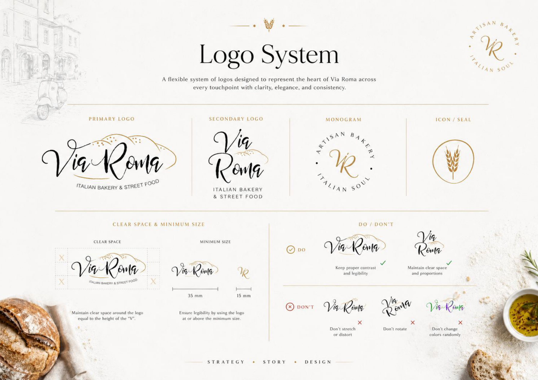
The primary script wordmark combines expressive lettering with a bread-inspired motif. A stacked secondary logo, VR monogram and wheat seal give the identity flexible forms for different sizes and applications. Clear-space, minimum-size and usage guidance support consistent reproduction.
Colour & typography
Warmth, heritage
and modern clarity.
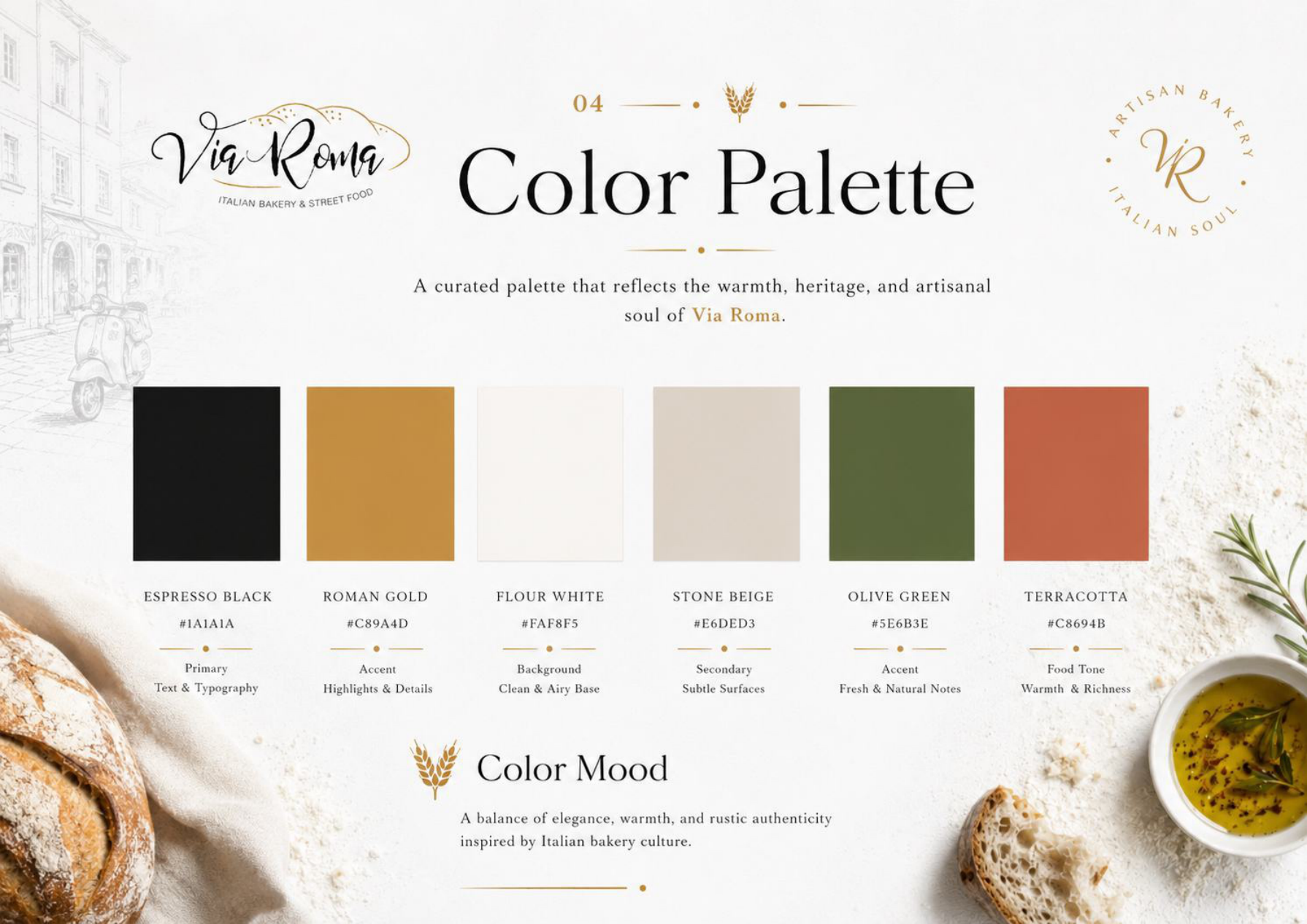
Espresso black and Roman gold anchor the palette, with flour white, stone beige, olive green and terracotta adding warmth and natural character. Cormorant Garamond gives headlines a refined editorial voice; Montserrat brings clarity to supporting information. The expressive script remains a signature element.
Visual language
A story carried
through the details.
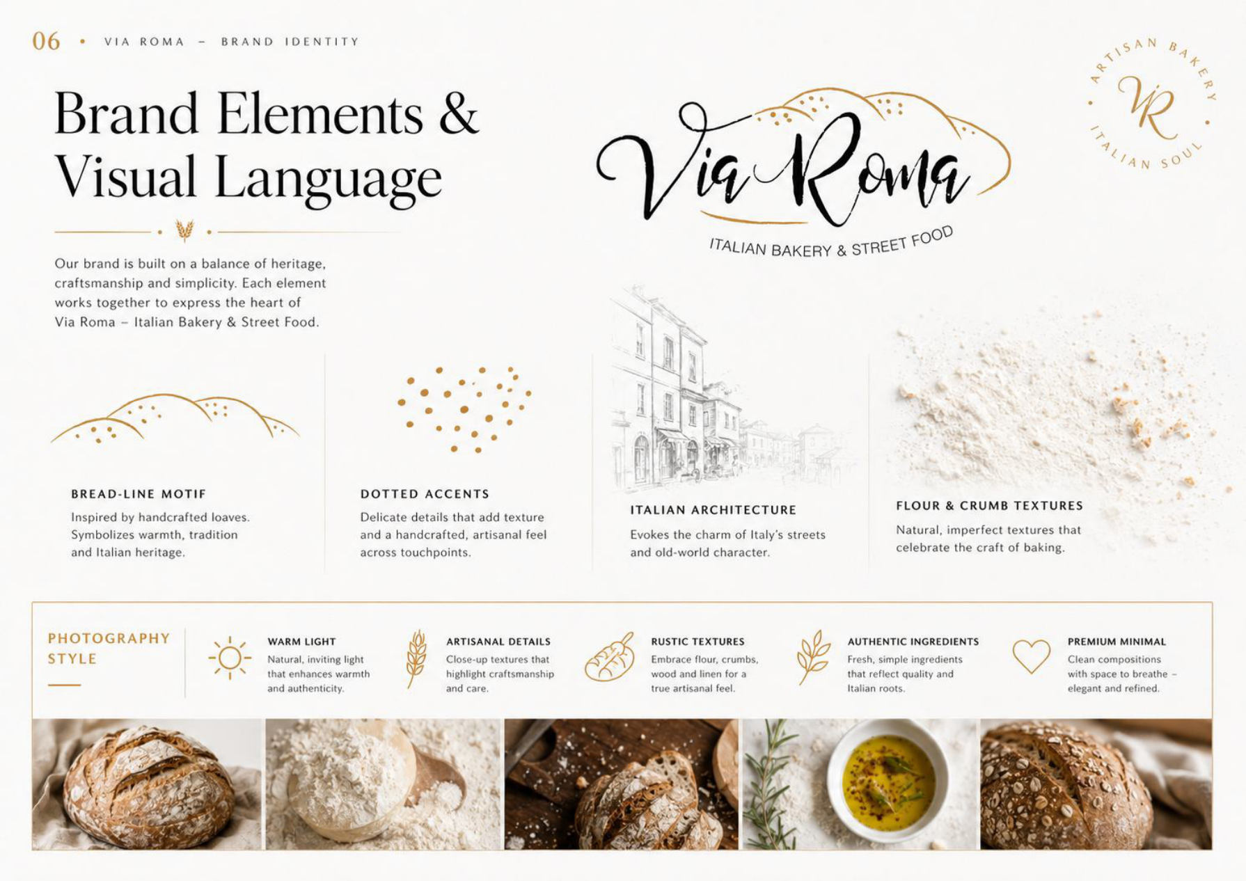
Bread-line motifs, dotted accents, Italian architectural sketches and flour textures connect the visual language to artisan craft. The photography direction favours warm light, ingredient detail and uncluttered compositions.
Brand in experience
Recognition across
every customer moment.
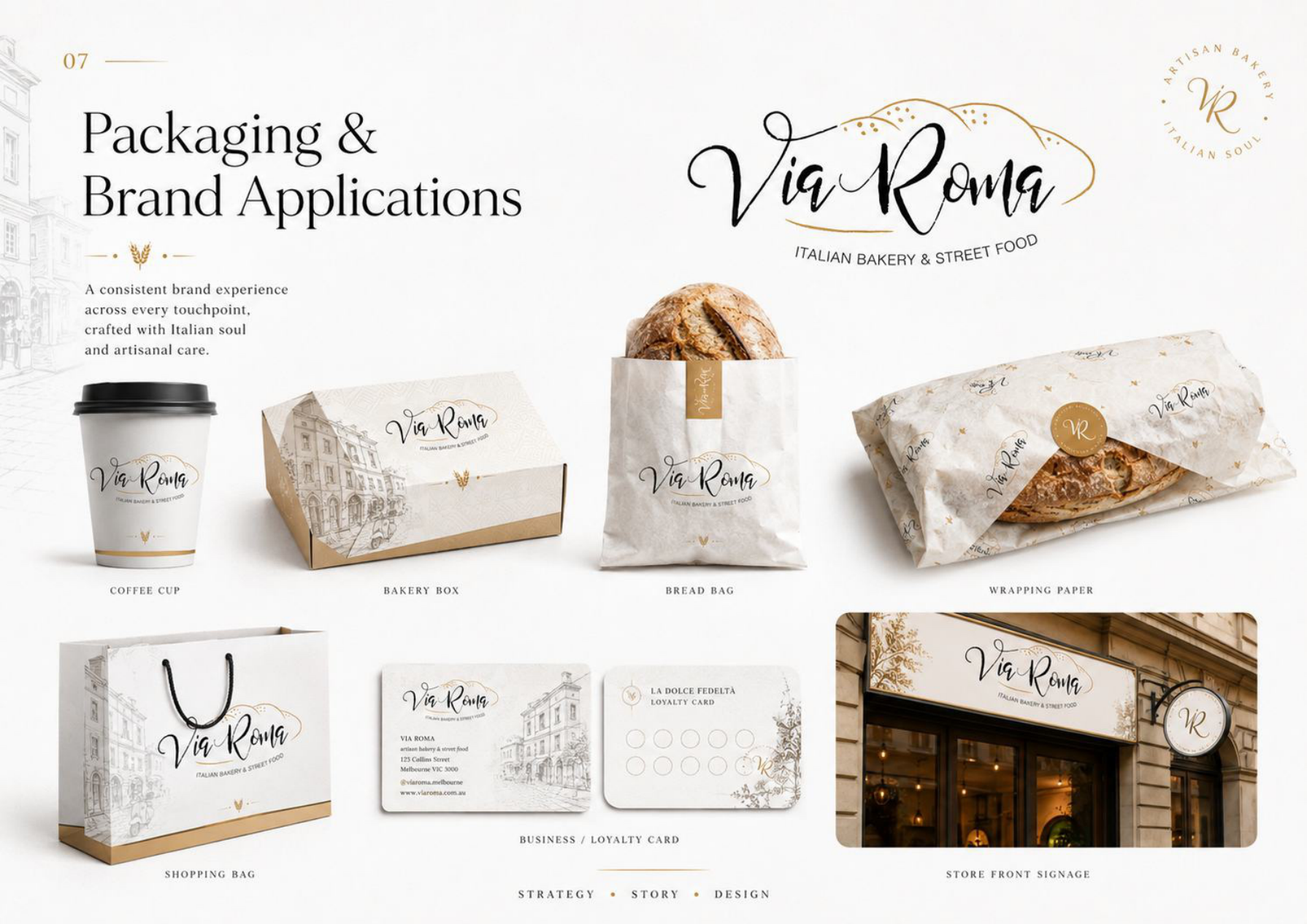
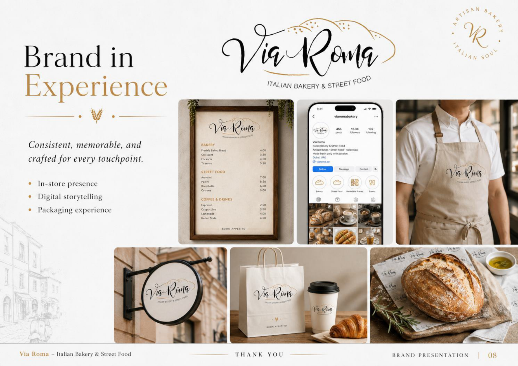
The presentation extends the identity into coffee cups, bakery boxes, bread bags, wrapping paper, shopping bags and loyalty cards. Storefront signage, menus, staff apparel and social content continue the same visual story beyond the packaging.
The business value of a system
Consistency makes
the brand easier to recognise.
A shared identity system gives teams and suppliers a clear reference for creating new materials. Defined logo variants, colour roles, typography and visual principles help the business carry its character from a storefront sign to a takeaway bag or social post.
The presentation demonstrates the intended brand experience and application direction. It does not supply measured commercial outcomes.
View full case studyKeep exploring
Other projects.
Construction ERP / CRM
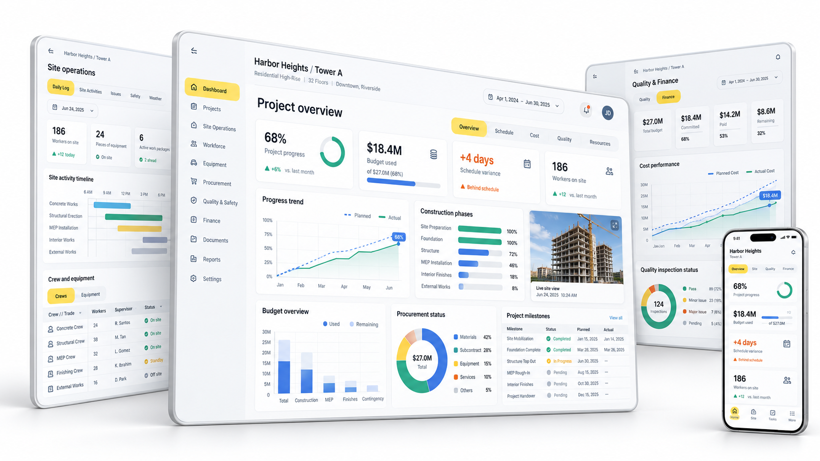
Connected project oversight, site coordination and quality workflows.
Explore project
OA EV Ecosystem
Brand, ownership, service and operations.
Explore project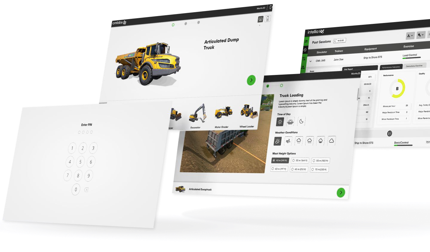
CM Labs VR Simulation
UX/UI for complex training workflows.
Explore project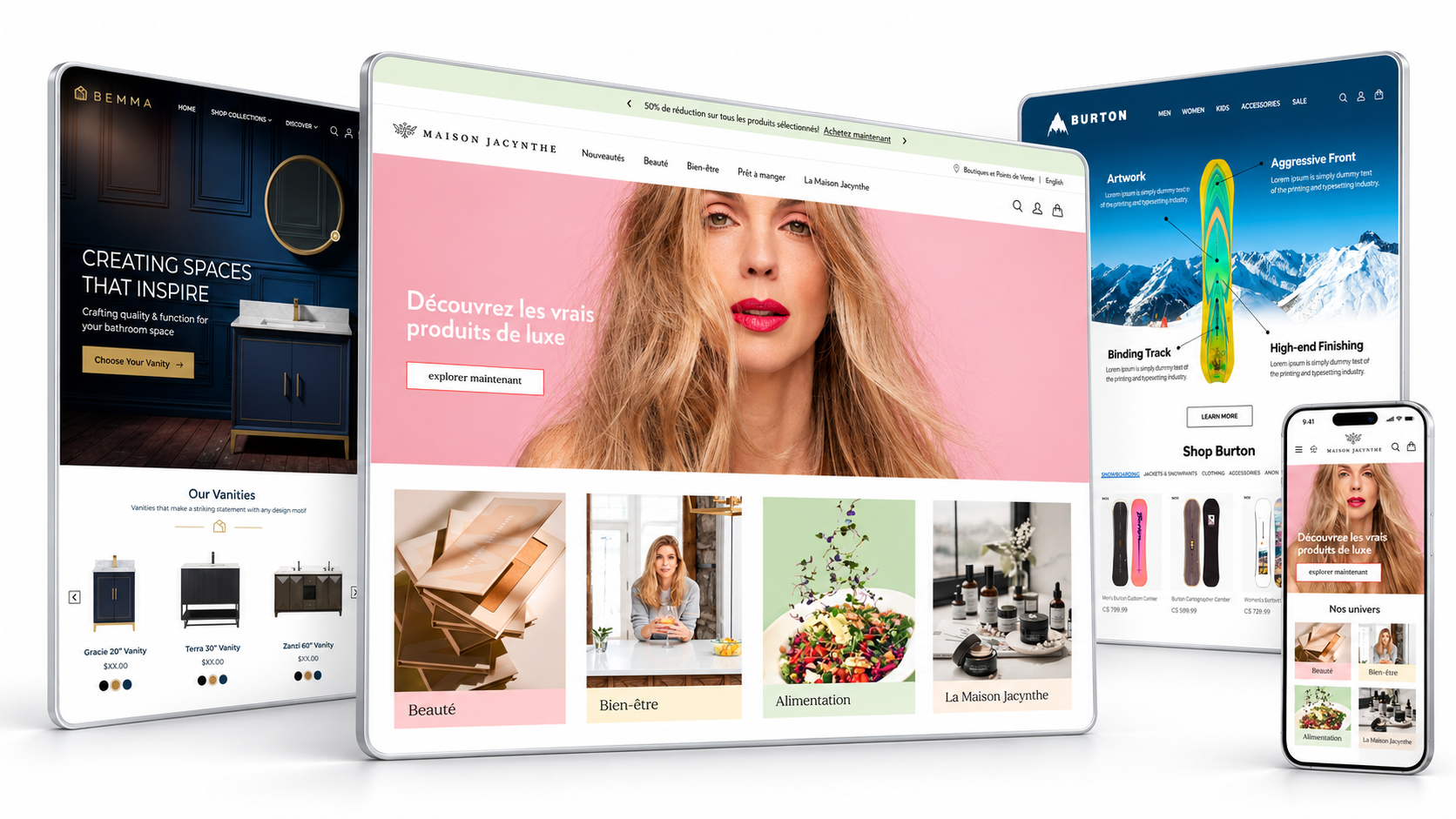
E-commerce & Websites
Retail experiences built around product discovery.
Explore project